Fly Delta
Mobile App Re-Design
Fly Delta App consistently features in user interactions with Delta Airlines, playing a pivotal role in the user experience. This experience is crucial in demonstrating Delta's corporate values and enhancing their service delivery.

CATEGORY
ROLE
DURATION
SKILLS
TOOLS
UI/UX
App Design
User Flow Modification
UX Researcher
UI/UX Designer
Oct - Dec 2023
User Research
UI/UX Design
PROJECT OVERVIEW
Background
This Fly Delta App redesign project, specifically focusing on the "MY TRIPS" section, aimed to enhance mobile usability due to identified issues with function placement, information architecture, and UI design.
Targeted at frequent business and leisure travelers requiring efficient travel management, the project sought to streamline the app’s layout and interactions to align with user behaviors.
Challenges such as disorganized information hierarchy, non-intuitive navigation, and a visually unengaging interface were addressed to improve the overall user experience and satisfaction, making essential travel tasks more accessible and less stressful.
DEFINING THE PROBLEM
Redesigning the 'MY TRIPS' section to improve logical placement and integration with all those frequently used features, refining the information architecture to create a more organized and intuitive hierarchy, and enhancing the UI to focus on key information with better use of color and design elements will significantly improve user interaction and satisfaction.
This approach is expected to streamline user workflows, reduce cognitive load, and increase engagement, leading to a more satisfying overall experience with the Fly Delta App.
My Hypothesis
In the initial research phase, I sought to understand the differences between Delta Airlines and other airlines, as well as their corporate values.
Following competitive analysis, I found that many airlines compete solely on price without distinct factors setting one apart from another. However, Delta's standout strategy appears unique—rather than competing solely on price, Delta strives to provide exceptional customer service to justify slightly higher fares compared to some competitors.
People choose Delta because they experience meticulous care when flying with them; this is a crucial factor that must be taken into consideration in the user research.
Understanding Delta Airlines and the Aviation Industry
User Experience Study
Frequent travelers are the focal point of this case study. It provided insights into what constitutes a delightful versus nerve-wracking flying experience.
Conversations with frequent flyers revealed several themes. Many cited Delta's excellent customer service and how even minor gestures made them feel cared for. Additionally, people seemed anxious about boarding, disembarking, and post-flight transit. After sifting through all responses, we found that improving the flight experience, both before and after, is as crucial as the flight itself.
Users of the Fly Delta app can be categorized as Frequent Flyers and Occasional Flyers:
The main persona would be the Frequent Flyers due to their reliance on the app's features to manage their frequent travel needs.
While important, occasional flyers serve as a secondary user persona, as their app usage may be less frequent than that of frequent flyers.
Understanding Delta, Especially Fly Delta App Users
Frequent Flyers...
☑️ Main Persona
Aim to efficiently manage their frequent flights, utilize loyalty rewards, book flights, select preferred seats, and check in quickly.
Occasional Flyers...
Typically seek to book flights for less frequent travel, check in easily for their trips, access boarding passes, and perhaps explore travel options and destinations
Frequent Flyers...
Design Questions
What are the key pain points in the current user experience, and how can they be addressed in the redesign?
How can the arrangement of functions and screens be optimized to align with typical user behavior and expectations?
UNDERSTANDING THE USERS
User Stories
User Story 1
As a frequent flyer, I want to have streamlined access to my flight information and real-time updates so that I can efficiently plan my travel, save time at the airport, and adapt to changes as needed.
User Story 2
As a frequent flyer, I want to have easy access to my past travel history and receipts so that I can keep track of my expenses for reimbursement and tax purposes.
User Journey Map

Reframe Design Questions
Based on further user research and the findings displayed above, I was able to further narrow down the problem statement, leading to the final design question:
How might we enhance the design of the MY TRIPS section to provide a more intuitive and engaging travel management experience?
Redesigned Wireframes

Screen 1 - Homepage
Screen 4 - Boarding Pass


Early ideation
Usability Test & KJ Analysis
Building upon the improved wireframes, I added foundational designs and created a prototype. With this, a usability test was conducted and KJ Analysis was performed.
Key observations were made by participants. Also, practical suggestions for improvements were also provided.
User Scenarios for Testing
In two days, you will be boarding a pre-booked Delta Airlines flight to Cedar Rapids to visit your friend. Use the Fly Delta app to complete the check-in process and save the boarding pass for your first leg.
You will be traveling to Lima on a pre-booked United Airlines flight tomorrow. Use the United Airlines app to complete the check-in process and save your digital boarding pass for future use.
🆚
Notes for Results of KJ Analysis

#1 Visual
Reduce the number of buttons appropriately or use different styles to differentiate between primary and secondary;
Fade some less important content;
Apply larger font size for titles on header.
#2 Layout
Make text alignment, including color shades, more consistent.
#3 Function
More functions can be added to Layover section, such as transportation guidance for changing between different terminal buildings in the airport.
Results of KJ Analysis w/ prioritized list of outcomes
Practical Suggestions for Improvements
○ Better visual and layout differentiation to aid users in efficiently navigating the app by distinguishing between primary and secondary elements
○ Introducing more distinctive and practical features to enhance the existing app's functionality
Refined Prototypes
After synthesizing and summarizing the insights gathered during the initial design process, I made further modifications to the Fly Delta app redesign. This led to the creation of a high-fidelity prototype as the final solution.
Before showcasing the prototype, let's recall the existing issues with the current app design Delta has—Unconventional Placement of Functions, Disorganized Hierarchy within MY TRIPS, and Rigid UI Designs. And the design question for this project is: How might we enhance the design of the MY TRIPS section to provide a more intuitive and engaging travel management experience?
Now let’s take the check-in flow as example to go through the new design, which includes screens of Homepage, MY TIPS pages, Flight Details pages, and Boarding Pass pages.
Phase1
Locate the specific flight (BOS-CID): 3 ways
Key Modifications
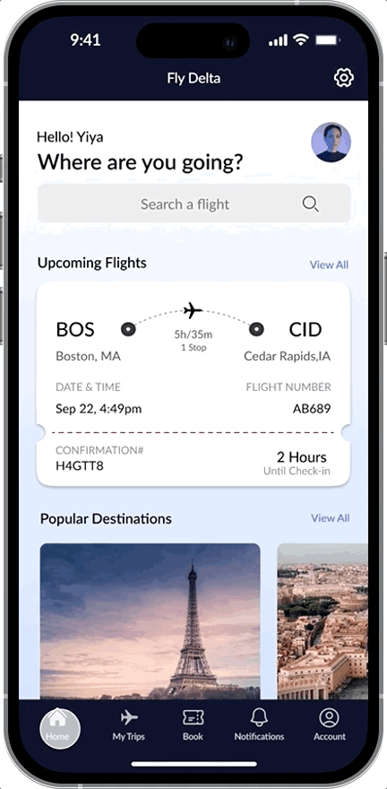
#HOME as dashboard
#MY TRIPS on navigation bar
#Preview Card of flight info
Design Statement
Upon logged in the app, we will now land on the homepage instead of being directed to the Account page as it currently does. I’ve added a Home page for our application, which serves as a dashboard gathering main features of the app, including search engine for booking flights, upcoming trips, destination recommendations, and ads or promotions below. Setting function is also added on the top nav bar. And I separate MY TRIPS from account, and place it in the nav bar, you can also notice that Account is now on the very right side.

Phase2
Look through the My Trips screen
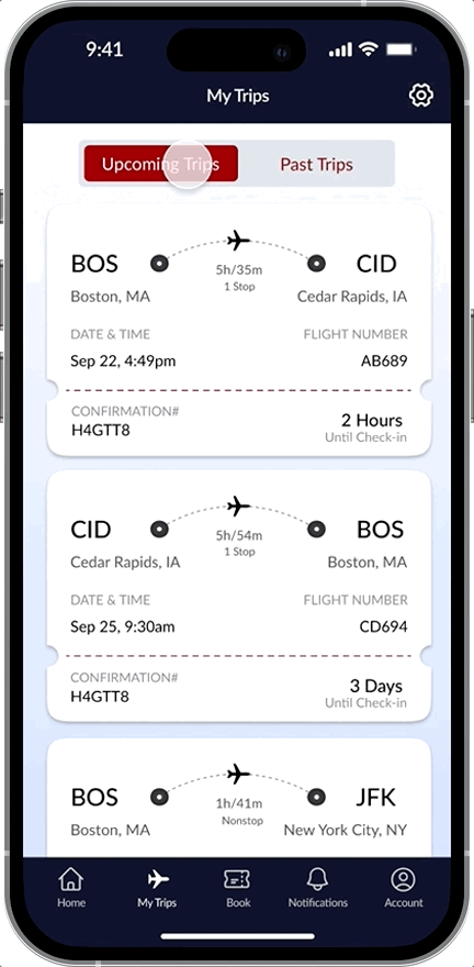
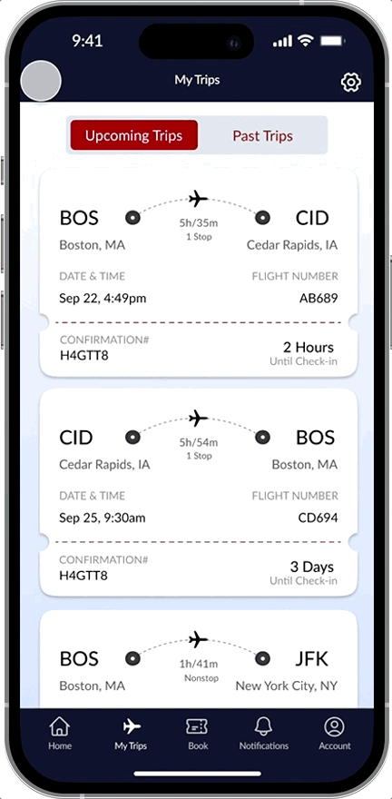
Key Modifications
#Switch Button for upcoming/past trips
#Brief trip info displayed
#Separated depart and return trips
Design Statement
I’ve added a switch button for users to easily toggle between upcoming and past trips. Using a boarding ticket-like design, this screen displays brief trip info, including Check-in or Boarding status. Unlike the original app, I separated depart and return trips for clarity in seat selection and trip sharing, or other info and services. Users have to manually add trips by entering info like confirmation numbers previously. Anticipating improved account synchronization, booked flights can now display automatically. However, I've maintained the option for manual addition at the bottom.

FINAL SOLUTIONS
Phase3
View and confirm flight information and complete actions as needed
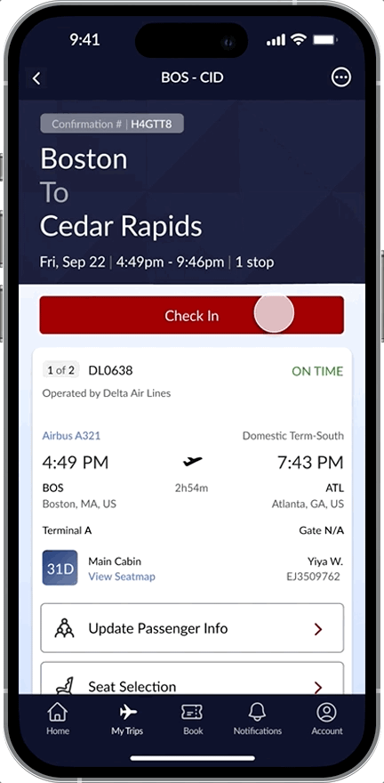
Key Modifications
#Improved alignment and clarity
#Adjusted font colors and button styles
#Layover functions
#Streamlined Check-In process
Design Statement
I have introduced additional trip details on the screen and reorganized existing information to enhance clarity and usability.
Following a KJ analysis, it was evident that participants desired a more structured presentation of information. As a result, I have refined font colors and button styles to prioritize and functionally differentiate information, facilitating a more focused user interaction.

Phase4
Access and save boarding pass(es)
Key Modifications
#Boarding Pass Overview page
#Ticket-like Boarding Pass screen
#Save to wallet function
Design Statement
After finish checking in, the button on Flight Details screen will change to Boarding Pass, which can lead user to the Boarding Pass Overview page. As this journey involves a layover, there will be two boarding passes.
Clicking the first leg, user can see a complete boarding pass containing all the essential information with the QR code required for boarding. Click the "Add to Apple Wallet" button, then click “Add” here, and the entire flow is now completed.

Recorded Presentation
After completing the final prototype, I recorded a presentation video that showcases the check-in flow for BOS to CID as an example of the design. I've also included key highlights and comparisons with the existing Fly Delta app.
If you're interested, feel free to take a look @ Recorded Presentation!
TAKEAWAYS
Lessons Learned
Despite being a feature-rich app from a major company, and undoubtedly well-considered in its iterations, the Fly Delta app still faces numerous complaints in daily use. In light of resource constraints, it's crucial to pinpoint the shortcomings of the current design to target the redesign effectively. This led to focusing the redesign efforts primarily on the 'MY TRIPS' section to enhance the app's user experience more efficiently.
Focus Design Priorities
The original plan for this project was a case study intended to include extensive data collection and analysis. Due to project time constraints and the necessity to maintain design quality, full data analysis wasn't feasible. However, extensive research was conducted to perform a thorough qualitative user analysis to understand user needs deeply.
Emphasizing Practical Scenarios in Design
Throughout the design iteration process, I conducted three staged design presentations, each simulating real business work scenarios, allowing me to gain valuable experience in presentation and team communication. Moreover, organizing a KJ Analysis for the first time in this project enhanced my project management skills.
Experience in Design Presentation and Project Management
01
02
03
Let's Collaborate!

Copyright @ 2024 Sammi Tang


